I led the UX/UI overhaul of Qore’s web experience—transforming a complex, inconsistent platform into a streamlined, personalized, and scalable system. The result? A 67% boost in active users, 52% higher customer satisfaction, and a 19% reduction in churn.
Industry:
Fintech
Duration:
16 weeks
🚀 Impact at a Glance
67% increase in monthly active users 📈
52% lift in customer satisfaction (CSAT) 😊
19% reduction in churn rate 📉
🔍 The Challenge
Qore, a digital banking platform, was losing market share amid rising fintech competition. Users reported difficulty navigating the platform, a lack of personalization, and inconsistent experiences across devices.
The challenge: How might we create a seamless digital banking journey to retain and attract customers?
💡 The Solution
Qore underwent a user-centered design transformation focused on improving usability, personalization, and consistency:
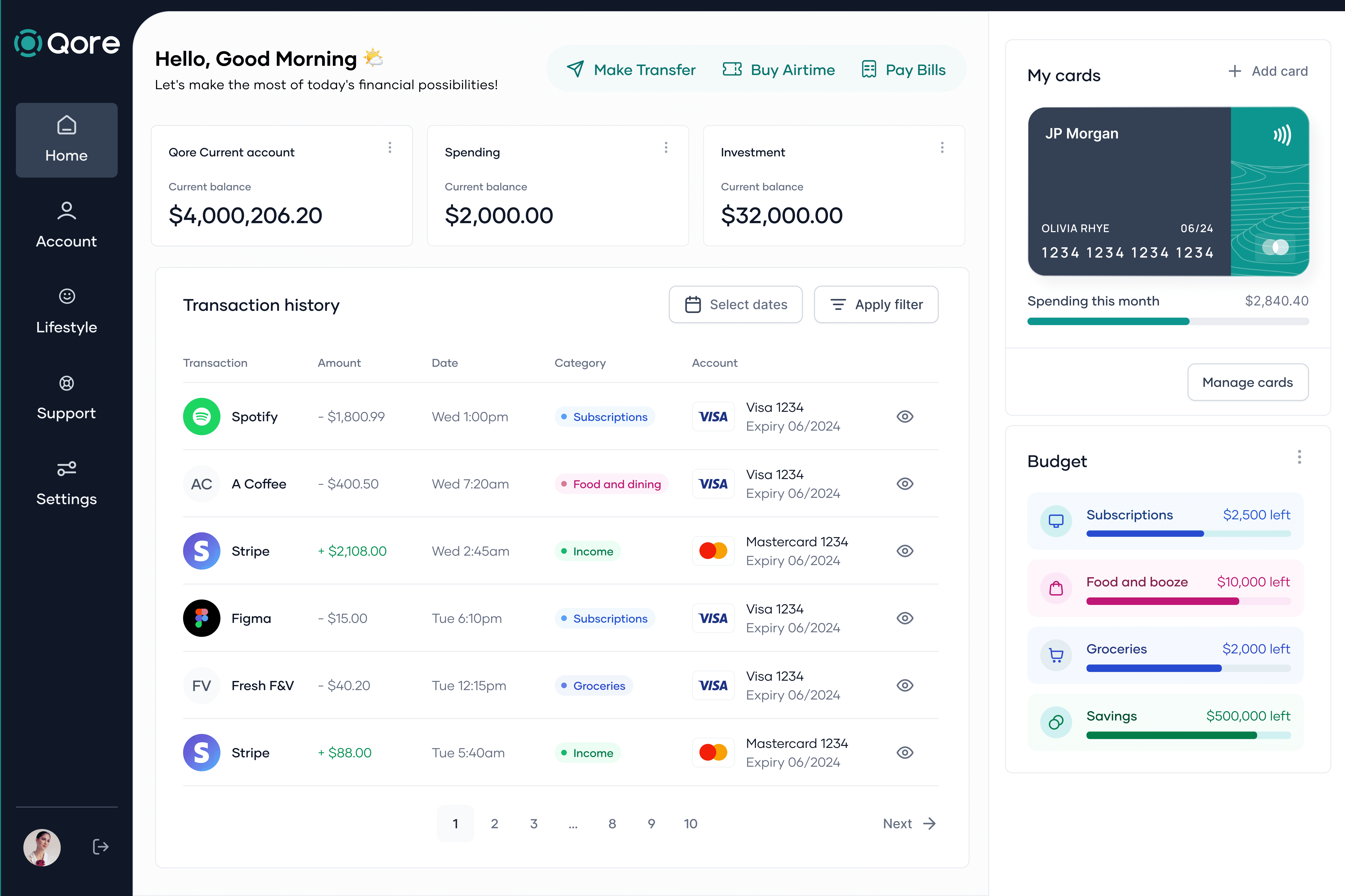
✅ Personalized dashboards – Dynamic financial insights tailored to user behaviours
✅ Seamless Navigation – Redesigned architecture for intuitive access to core features
✅ Cross-platform consistency – Unified experience across web and mobile
🎨 My Role
Design Leadership: Led the end-to-end UX/UI strategy for Qore’s web banking platform redesign.
User Research & Analysis: Conducted in-depth interviews and synthesized insights into actionable design decisions.
User Flows & Wireframing: Redesigned information architecture for better user engagement.
UI Design & Prototyping: Created responsive high-fidelity prototypes and interactive demos for validation and handoff.
Collaboration: Worked closely with 3 designers, 1 product manager, and 3 engineers in agile sprints to deliver and iterate quickly.
📊 Research & Insights
We conducted research with over 25 users across three personas. Key findings included:
Users prioritized simplicity, personalization, and intuitive navigation as top needs.
Confusing dashboards and complex flows were directly tied to a 22% churn rate.
76% of users requested more structured and goal-oriented dashboards for improved financial visibility.
64% of users reported frustration with inconsistent experiences across the web and mobile, which affected trust and usage frequency.
These insights informed a focused redesign of the platform's structure, interface, and core workflows.
✨ Key Features & Outcomes
✅ Personalized Dashboards – Surfaced meaningful insights like spending trends, savings progress, and goal tracking based on user behaviour.
✅ Streamlined Navigation – Reduced steps in key tasks (e.g. transferring funds, tracking expenses), improving task completion time by 37%.
✅ Cross-Device Consistency – Unified interaction patterns and visual design across devices, boosting user confidence and usage on mobile by 42%.
✅ Scalable Design System – Introduced a reusable component library to maintain visual consistency and accelerate development velocity.
🏆 Results & Business Impact
After launch, the platform saw meaningful gains in both user engagement and business KPIs:
📈 67% increase in monthly active users – Driven by improved onboarding, dashboard usability, and mobile retention.
😊 52% lift in customer satisfaction (CSAT) – Measured via post-session surveys and support interactions.
👍 23% increase in positive brand mentions – Reflected in app store reviews, NPS feedback, and social listening data.
🌟 Takeaways
User-Centric Iteration Drives Growth – Our test-and-learn approach allowed us to align the product closely with user expectations.
Personalization Enhances Retention – Tailored experiences made the platform more relevant, increasing daily active users.
Innovation is Continuous – Always refine, evolve, and stay ahead